design
Interesting Designs in Japan, Through My iPhone Lens
Written on 06 April 2024
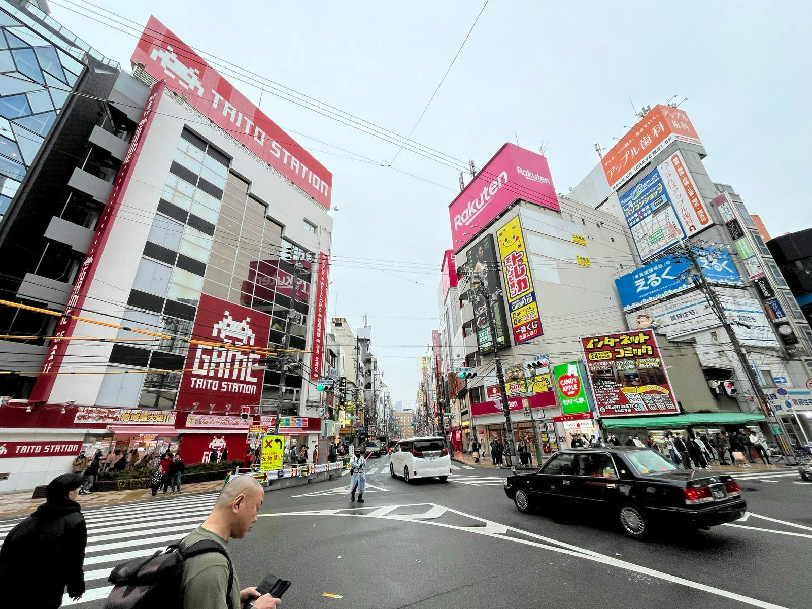
I was recently in Japan for a vacation and noticed several interesting aesthetic and functional designs. Initially, I was not intentionally looking out for them. Being in a different country altogether, I felt less on auto-pilot. And things that were different from those in my usual environment just caught my eye. Once I observed a few, I became interested in finding more.
Garasu-do
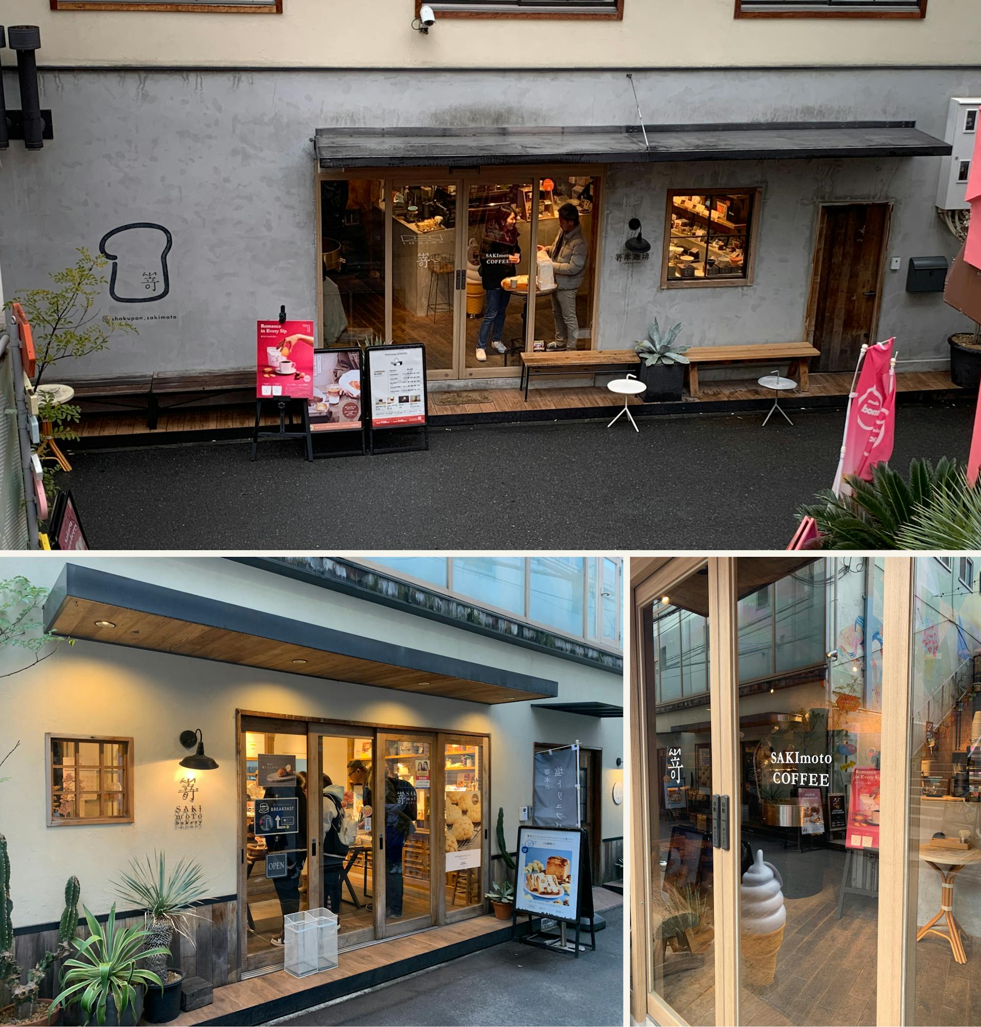
My family seldom revisit places when we are travelling but we went to SAKImoto COFFEE thrice. It also has a bakery and cafe right next to it, all hidden in an unassuming alley. Besides its secluded location, we also love the aesthetic of the garasu-do (glass doors with a wooden frame). The wood made the coffee place feel traditional while the glass made it feel modern. Instead of contradicting each other, the two materials complement each other well, creating a minimalistic and sleek aesthetic. The white logos on the glass doors add a nice touch to the design.
Illustrations
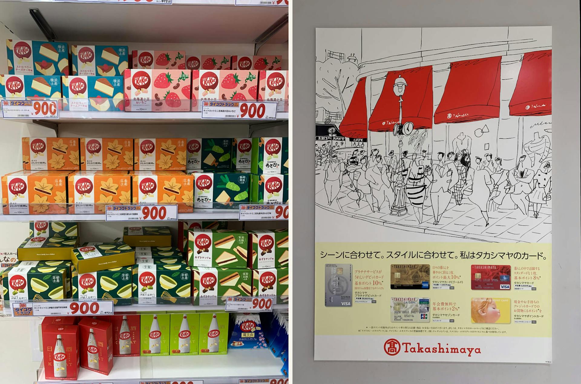
Given the history and popularity of manga in Japan, it was not surprising to see illustrations everywhere—on snacks, posters, and electronic displays. Despite all being illustrations, they managed to convey very different ideas and vibes.
Hotel designs
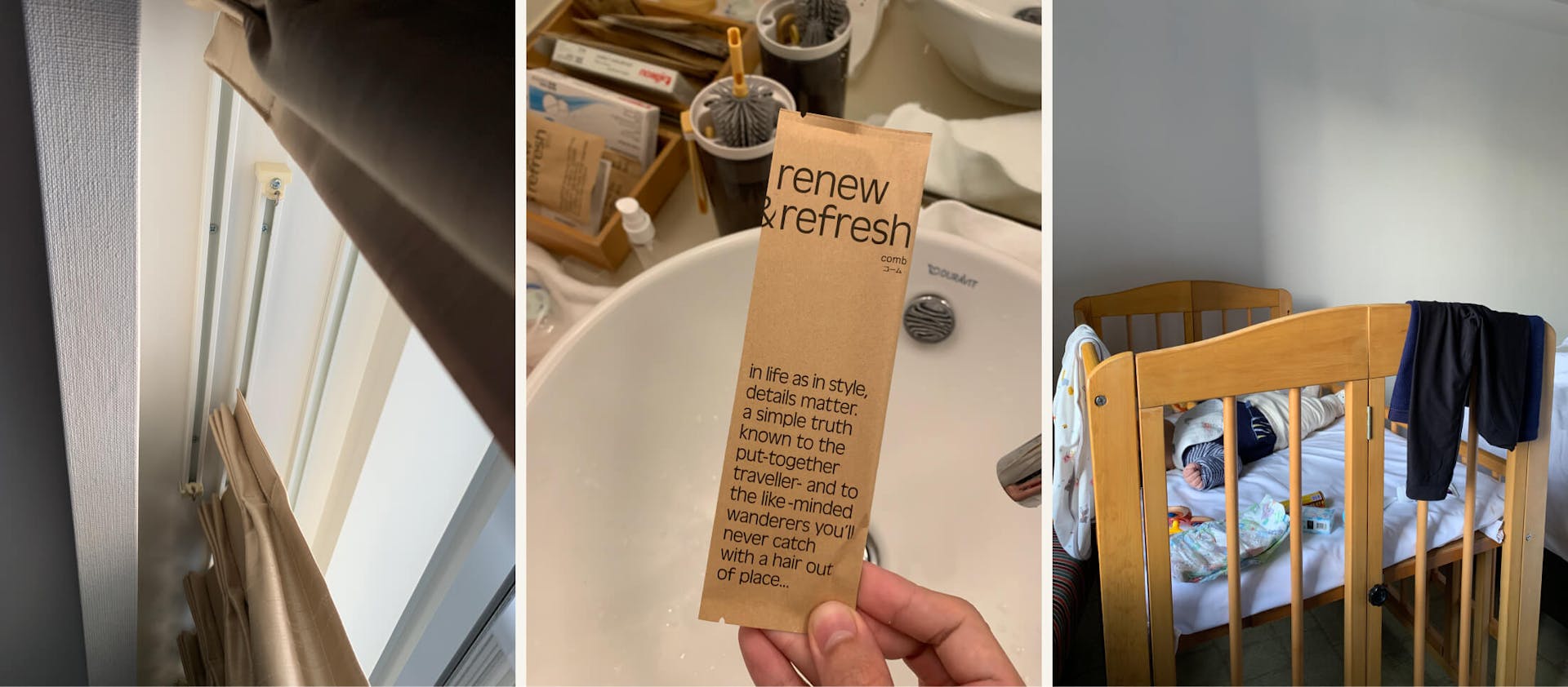
Ever been awoken when the sun shines through the gap between the two sides of the curtains, even when the curtains are drawn? Argh. A life hack is to use the hotel hanger, those with clips, to clip the curtains together. But Swissotel Nankai Osaka's rooms have overlapping curtain tracks, so I didn't have that issue.
The packaging of every toiletry has an elaborate description of the mundane article. The copy, "in life as in style, details matter", encapsulates this additional design element perfectly.
The cot I have at home has a horizontal surface at the ends for placing things, which is convenient. So I was intrigued to see the curved design of the hotel cot. While less functional, it feels softer and gentler. It's a helpful reminder that designs should not always be optimized for function only.
Automations
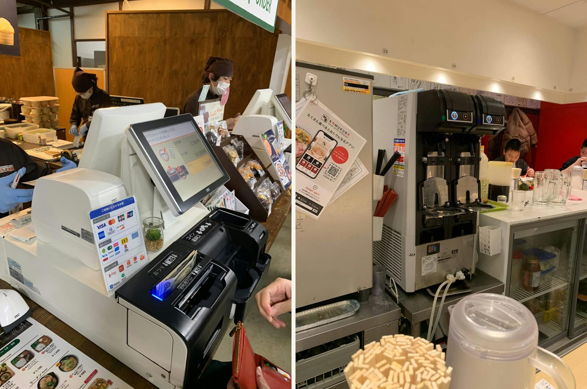
While I know Japan is known to be an efficient country, I was amused and impressed by the machineries and automations I saw. Most restaurants, especially those with long queues, use an automated cash register, which can instantly calculate and return the right change to customers. Electronic payments would be even better, which they do offer, but cash is still the preferred payment form in Japan.
At one of the popular ramen restaurants, there is even a machine that tilts the mug as it pours the beer. I'm sure there are more even fascinating machineries that I missed.
